Setting the
standard for Europe
Belfast Healthy Cities is a non-profit committed to improving the health and wellbeing of people living and working in Belfast.
Belfast Healthy Cities doesn’t run hospitals or write policy. Their job is getting government, public services and community groups into the same room and getting things moving.
In the World Health Organization’s European Healthy Cities Network, other cities look to them as an example of how that’s done.
The Challenge
The brand hadn’t kept pace with the organisation. The old logo still carried the wrong name — Belfast Healthy City, not Cities — a small detail that pointed at a bigger gap between how BHC presented itself and who they’d become.
One rigid lockup, no flexibility across touchpoints, inconsistencies everywhere you looked. BHC was also entering a new phase of the WHO framework, which made this the right moment to draw a line and start fresh.
Process
We started by listening. Eight stakeholder groups, internal workshops, a full round of questionnaires — we wanted to know what BHC stood for, not just what they did, and what the people closest to the work actually needed from this.
One idea kept coming back: BHC doesn’t deliver health outcomes directly. They spark them. That became the foundation for everything else. The brief stopped being “modernise the logo” and became “build an identity with the same energy and optimism as the people doing the work.”
Solution
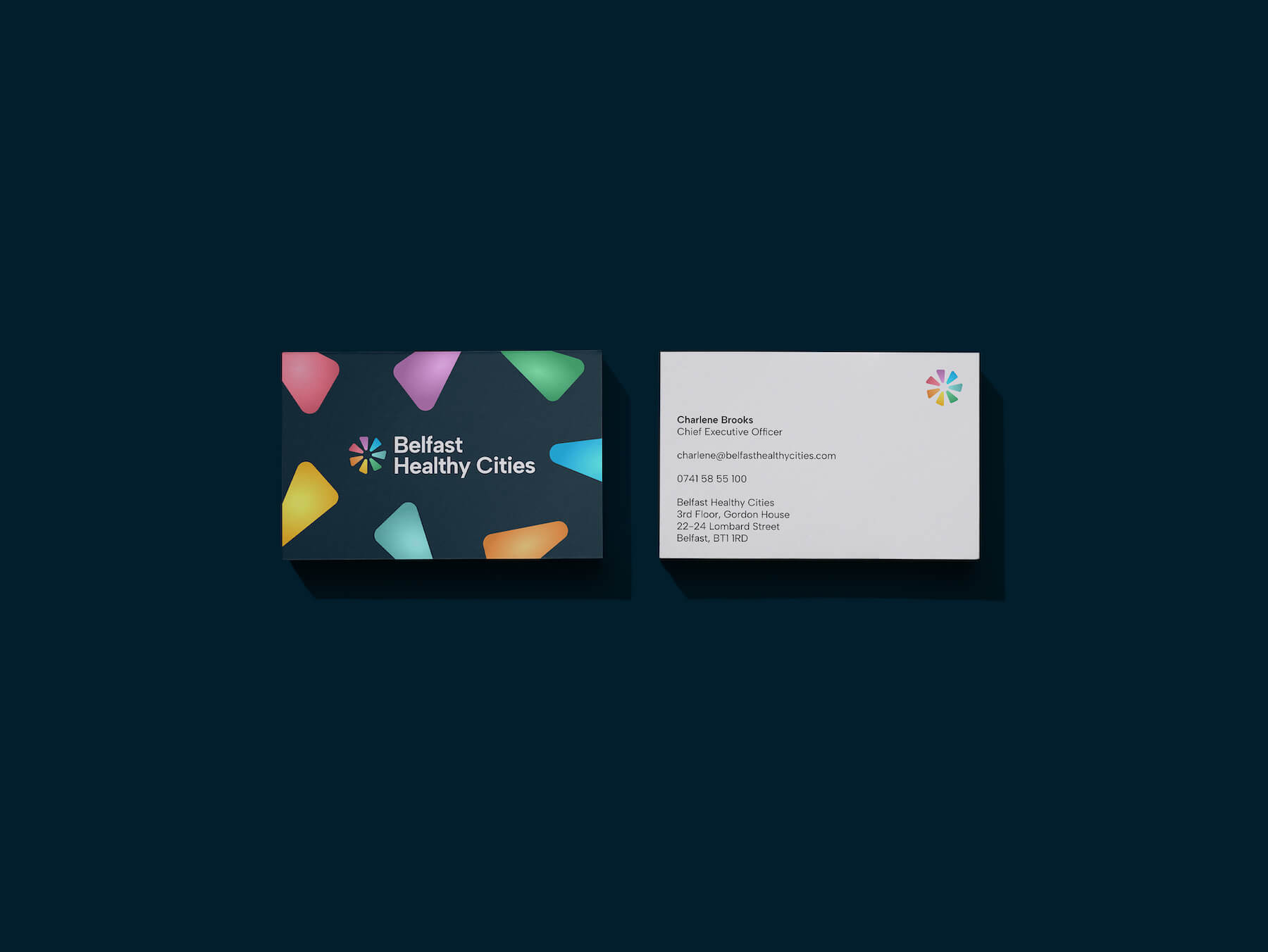
The new mark is a radiating form made of seven segments, one for each area BHC works in. It draws on two things at once: the energy of a spark, and the Phase VII wheel that underpins BHC’s current work. The colours come from that same framework.
It’s warm as well as energetic — there’s a deliberate nod to a childhood pinwheel, something that sits as comfortably in a school as it does in a formal report.
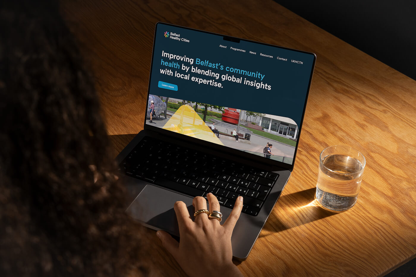
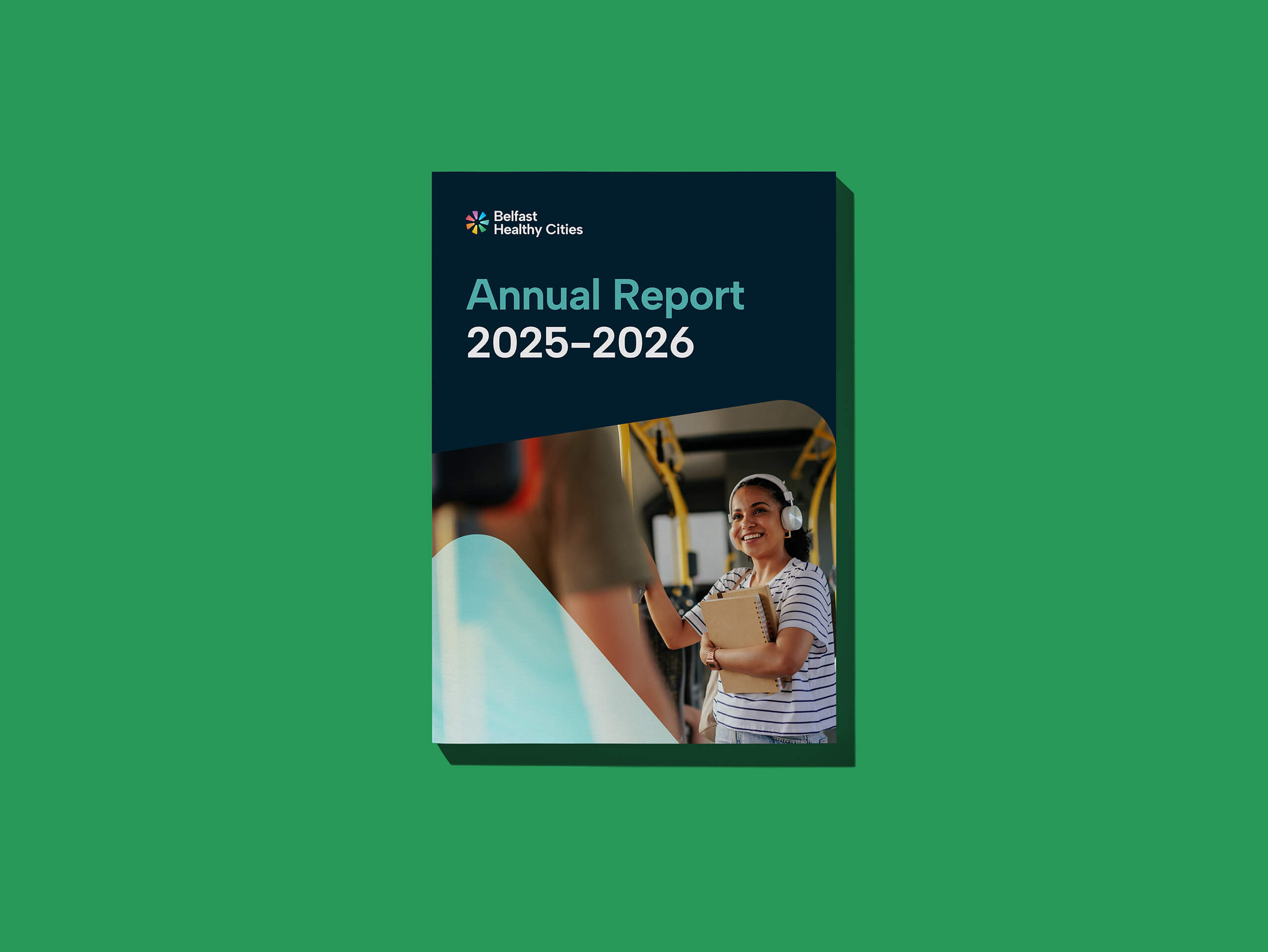
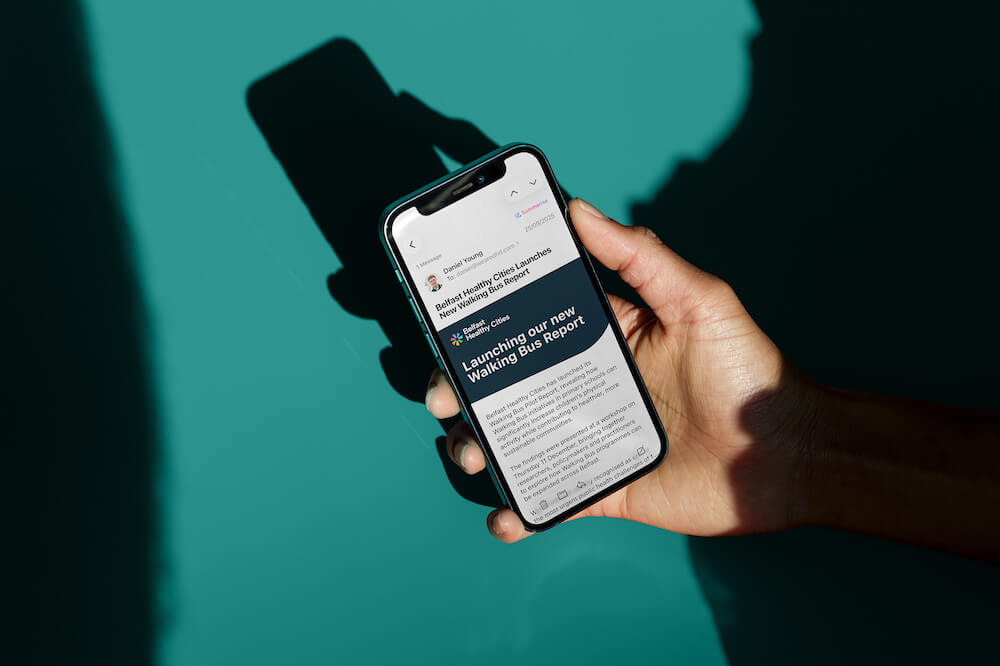
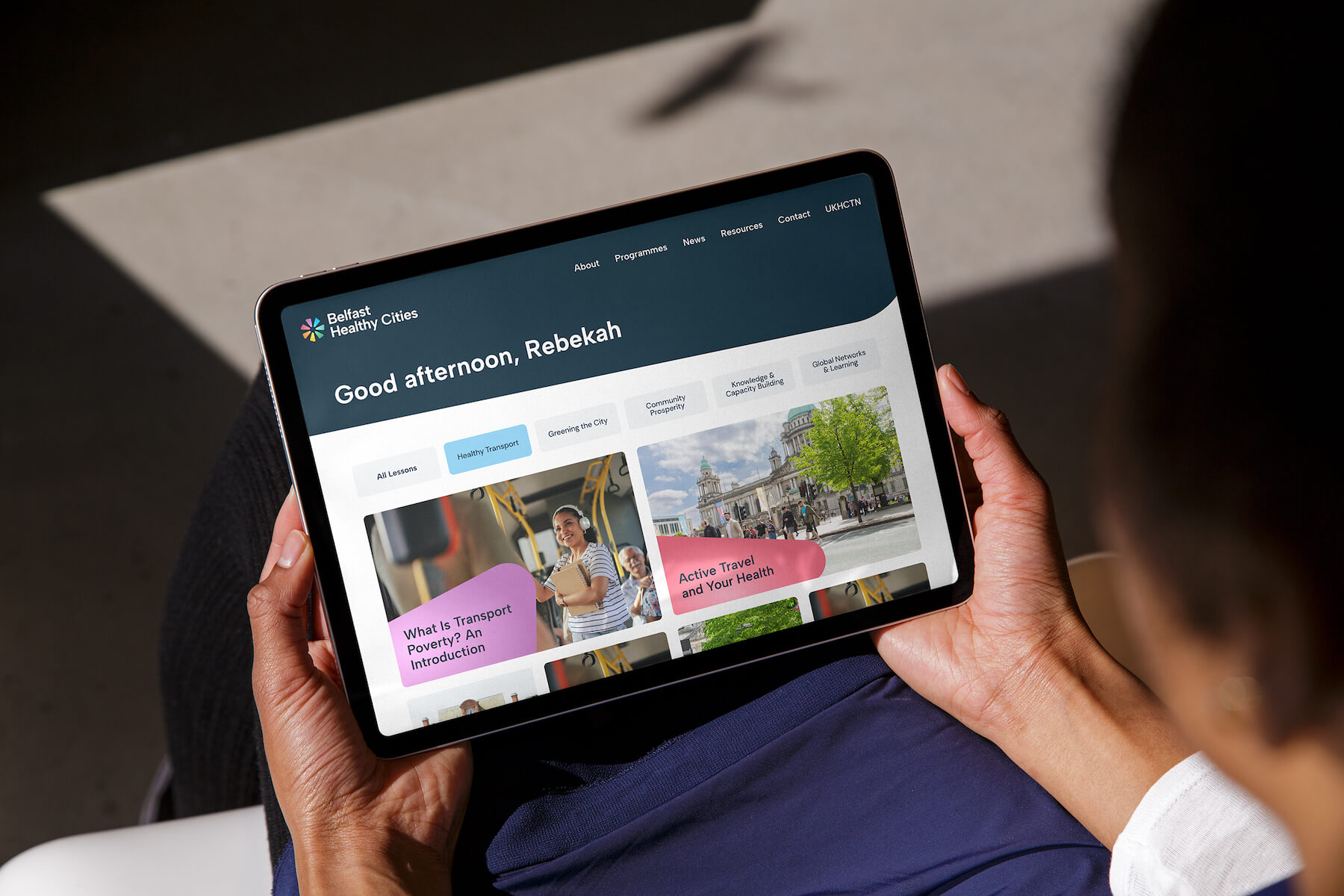
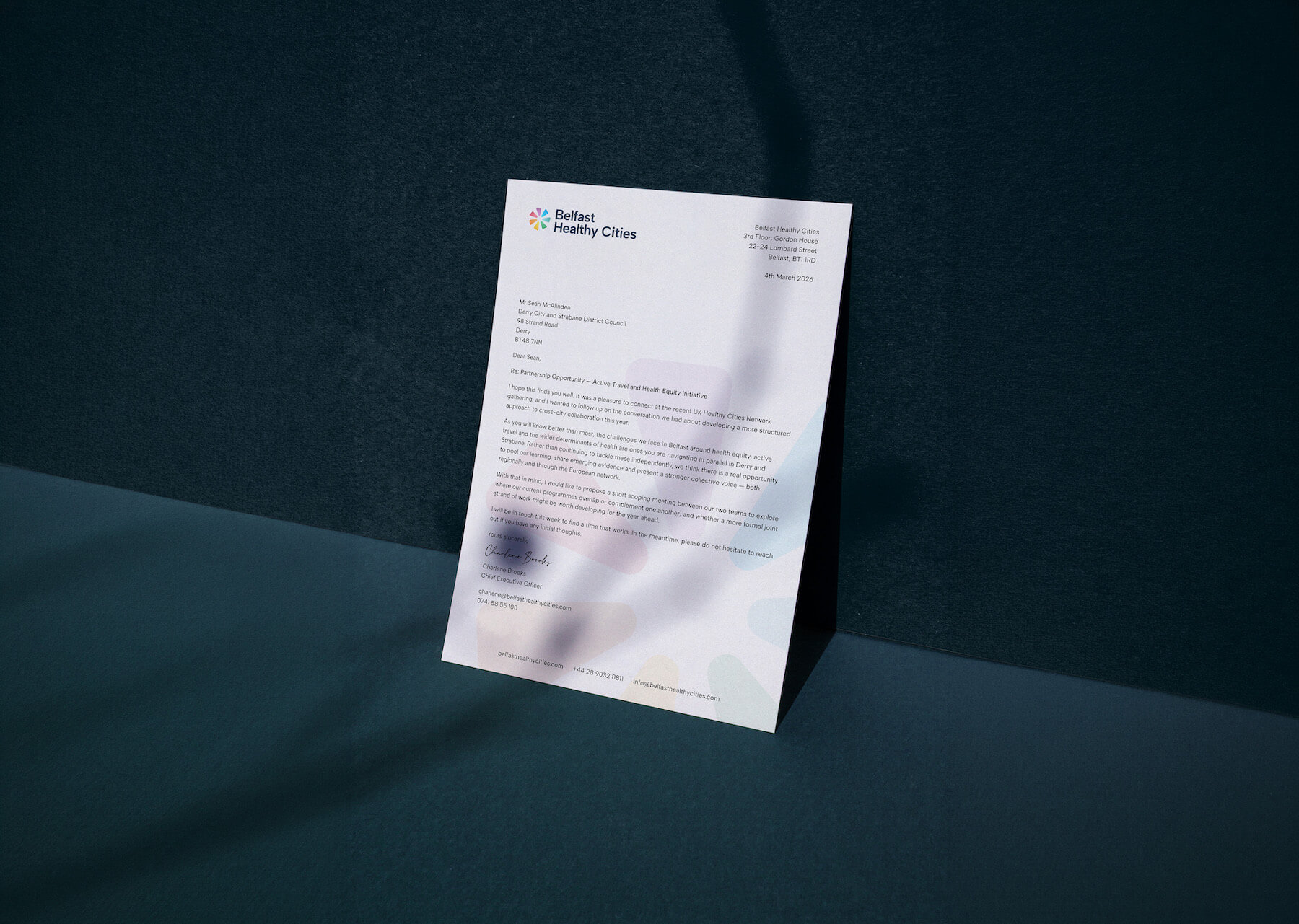
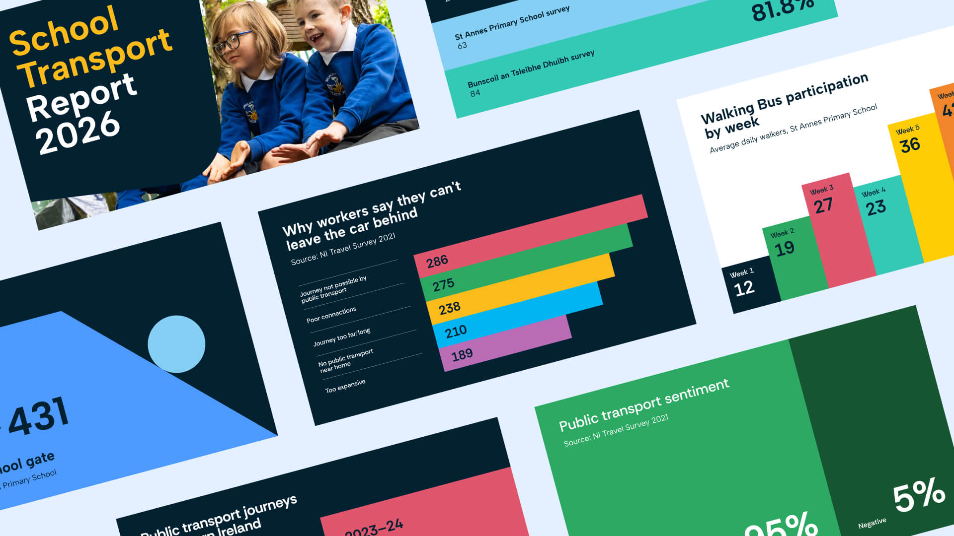
The wider system was built to flex: a considered colour palette, a flexible typographic system, and templates for documents, reports, social graphics, presentations, email signatures, signage and prop boards, so the team can show up consistently at any scale. Motion graphics bring the messaging and mark to life on film.