
Ballymena Academy
A fresh look for a
200-year-old identity
Some brands are born yesterday. Others carry the weight of centuries. Ballymena Academy is the latter – a school with 200 years of heritage, a coat of arms that had taken on near-mythical status, and a visual identity that needed clarity, cohesion, and a future. That’s where we came in. Working with the school, we set out to honour the past while preparing for what’s next – modernising the brand without losing the stories, the symbols, and the sentiment that make it matter.
Finding the meaning
From first glance, the original coat of arms held undeniable power – rich with symbolism, heritage, and intent. But it wasn’t built for modern applications, and over time, it had fractured into a sea of inconsistent versions (we found 20 at our first visit alone) and misused colours. We set out to bring clarity. Starting with conversations – many of them. The largest stakeholder group we’d ever worked with. Questionnaires, on-site visits, and deep archival dives helped us understand not just what the brand was, but what it meant.
Digitally native, historically rooted
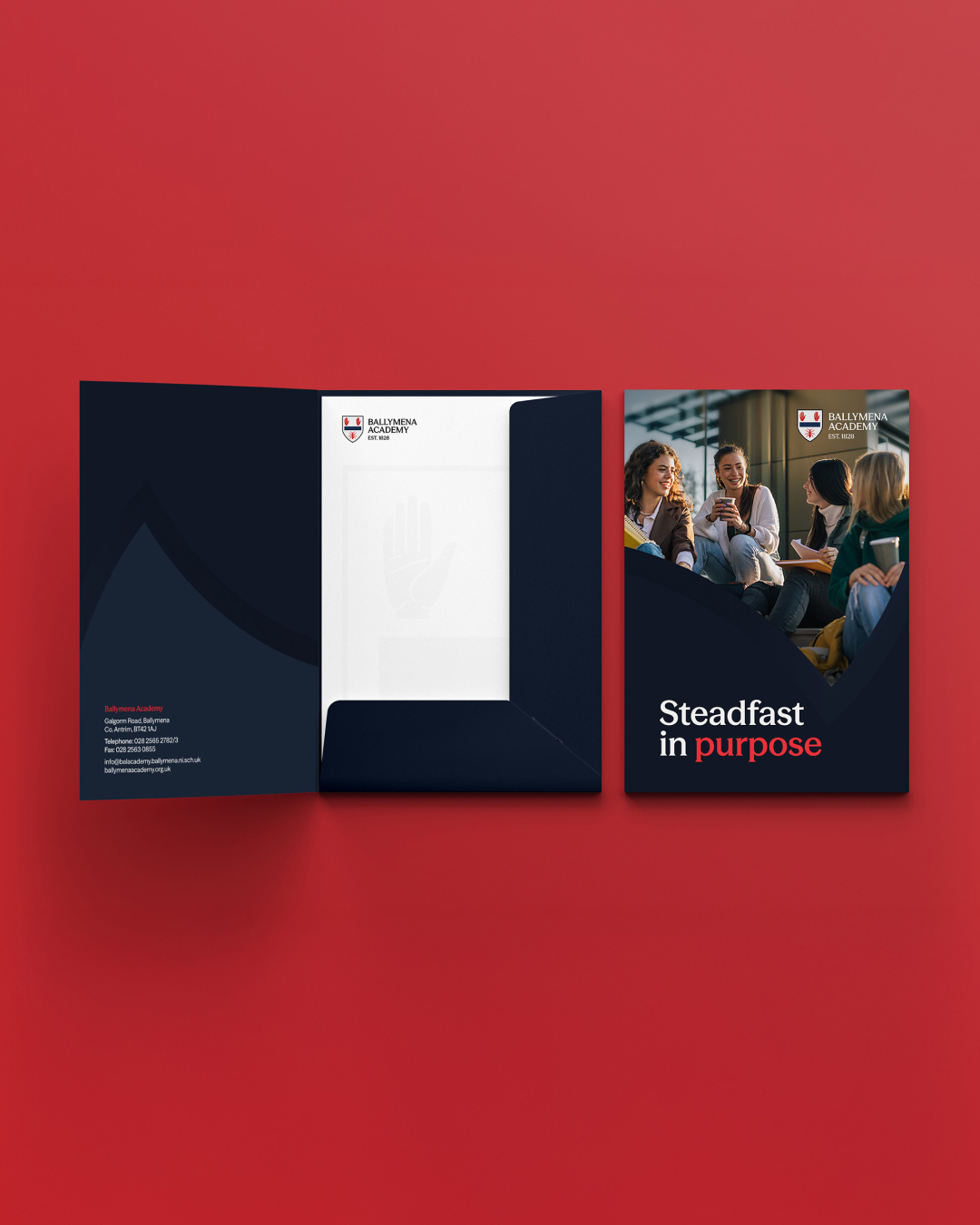
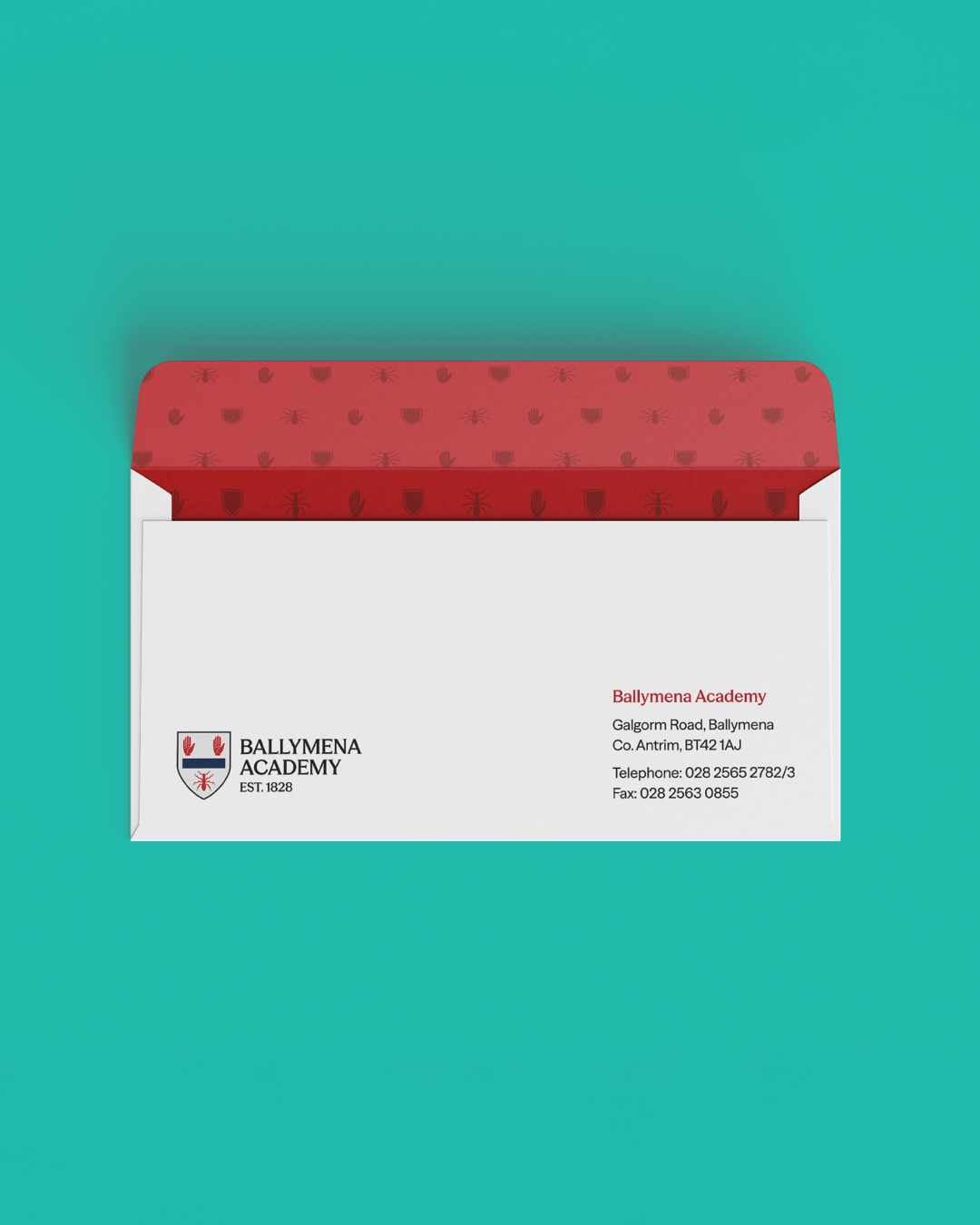
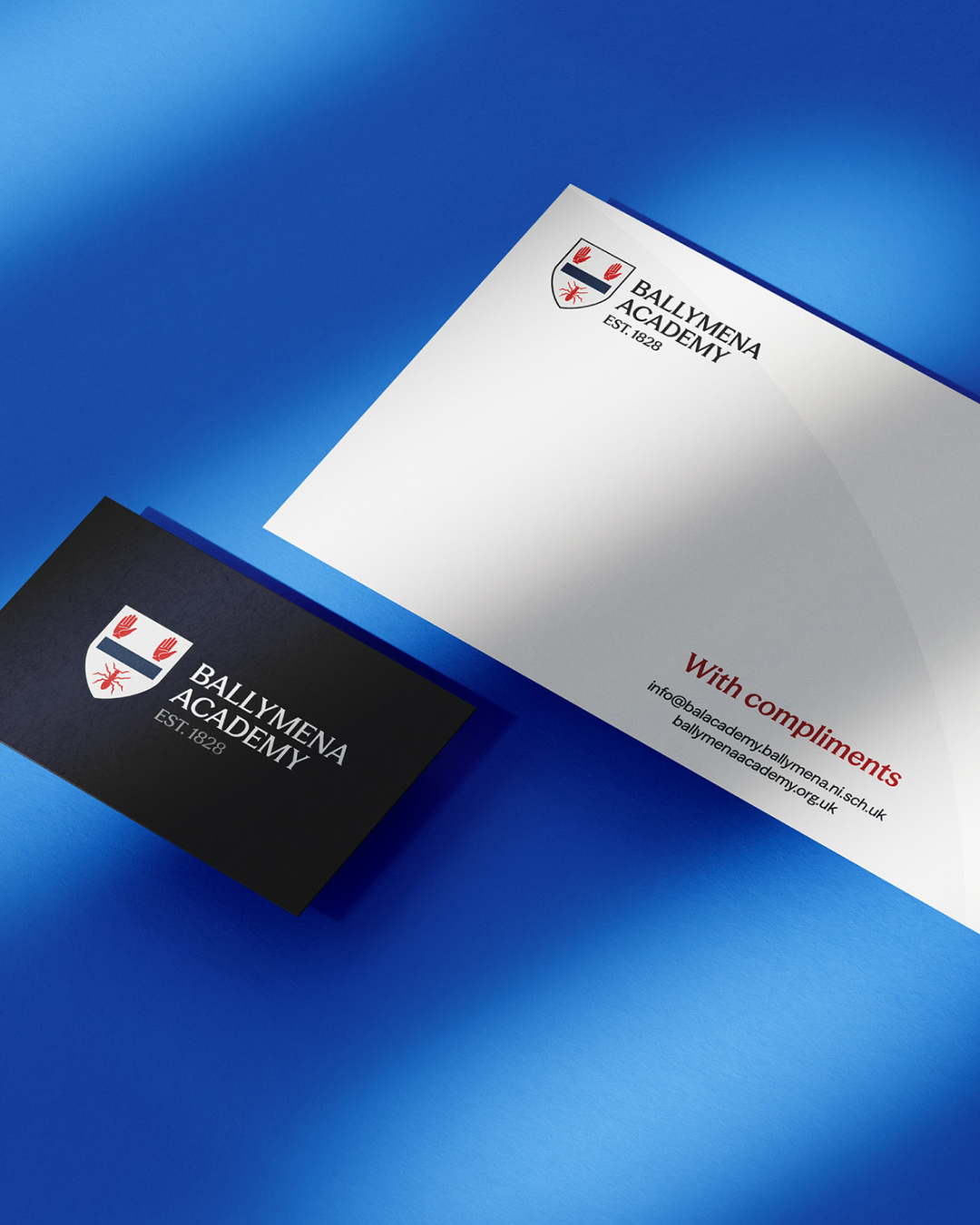
With that research under our belt, we redrew the coat of arms with care – not for modernity’s sake, but to preserve what mattered and prepare it for where the brand needed to go. Every symbol kept its place. Every meaning stayed intact. Just cleaner, sharper, and ready to live across digital and physical spaces. For the core typeface, we landed on Season by Displaay – a versatile collection that balances heritage and utility. Through conversation, another idea emerged: a simplified mark, extracted from the coat of arms itself. We call it the shield – a distilled identifier that holds the spirit of the original coat of arms, while being built for the digital world.
Reframing tradition
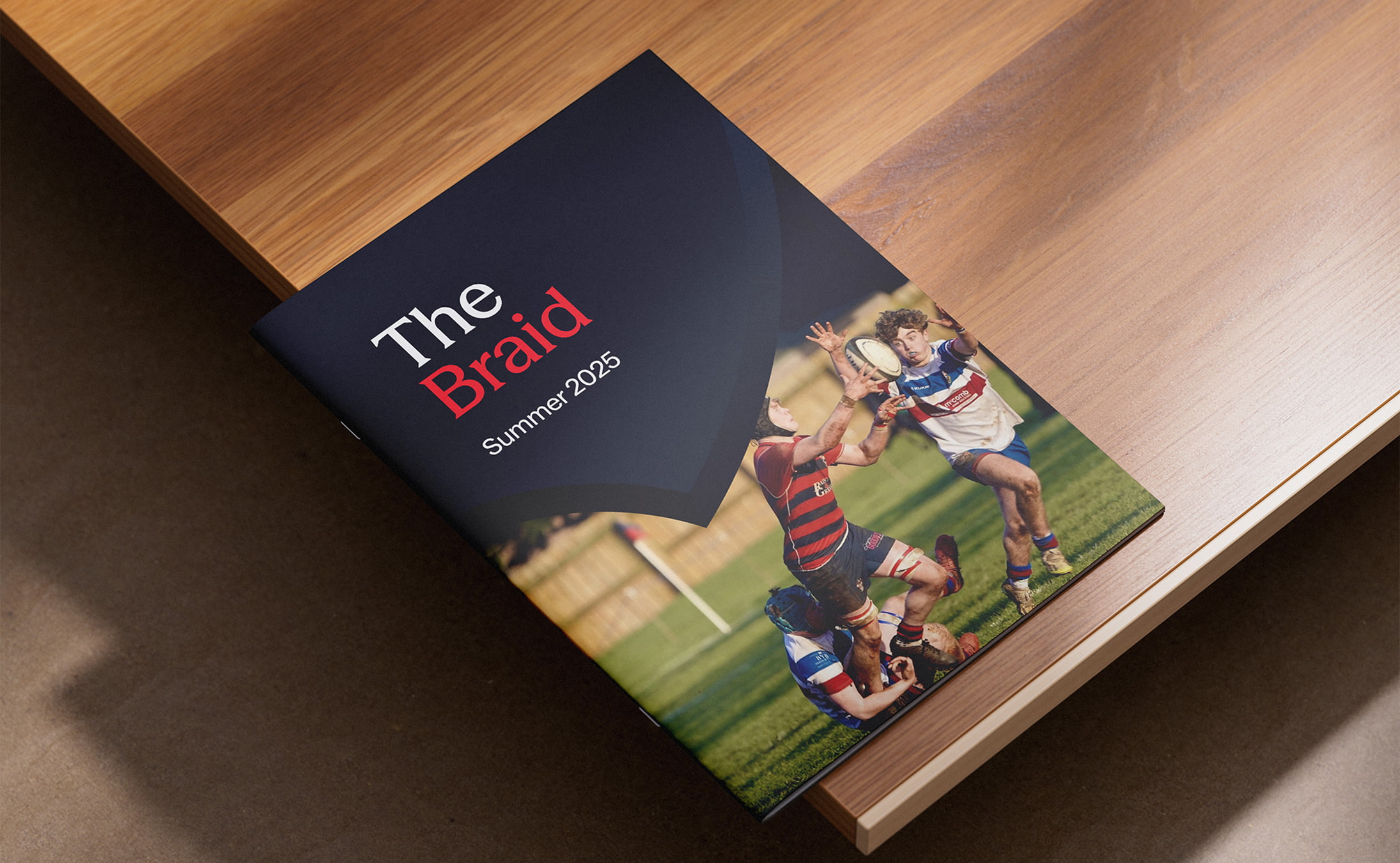
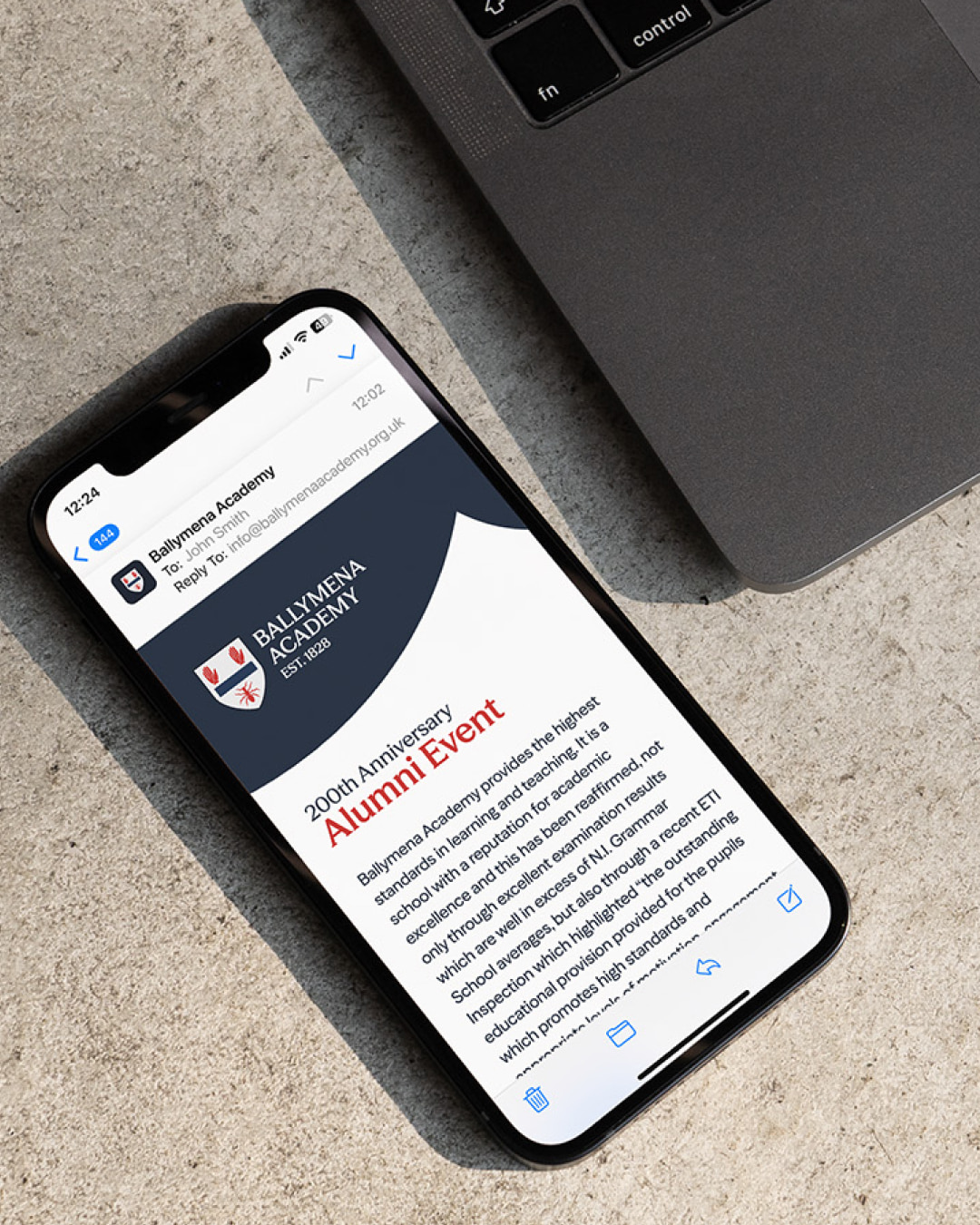
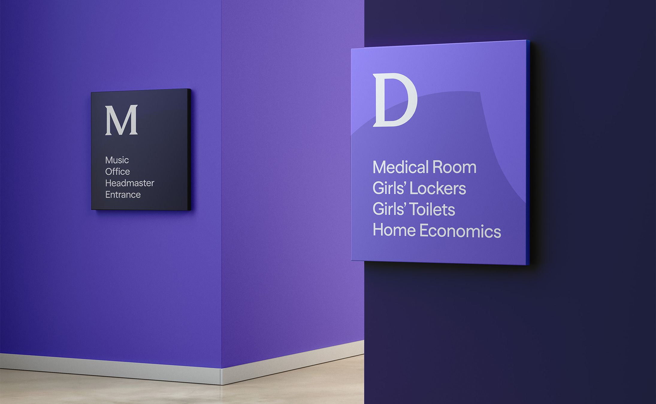
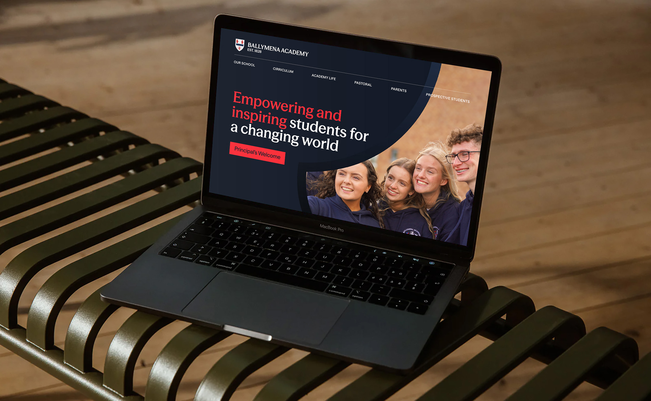
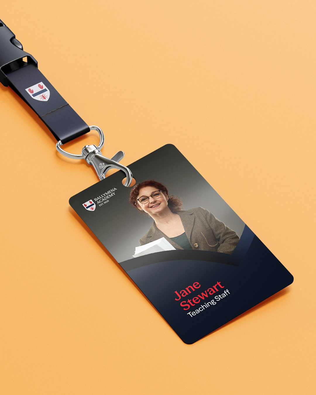
The wider identity system is also surrounded in history – but reframed for today. The coat of arms mantling became a signature compositional element. A flexible visual thread tying heritage into modern applications. Variable fonts flex between serif and sans, adjusting to the context. And an expanded colour palette – drawn from the architecture of the school itself – brings range and warmth. We’ve continued working with Ballymena Academy to roll out the brand across everything from prospectuses to social templates. We’re also in the process of refreshing the school website. But first – it’s the summer holidays.

Special thanks
A big thank you to the staff at Ballymena Academy. Giving up free periods and working around full schedules is never easy – but their willingness and enthusiasm to collaborate made all the difference. They were generous with their time, responsive when it mattered, and genuinely up for the challenge.